Plotting graphs
Sometimes it is useful to visualize your scenario to understand the behavior of mosaik. The plotting helpers in mosaik.util take the world object and a folder argument that controls where image files are written.
Optional parameters are slice (see below) and show_plot (default: True). With show_plot you can control if a window is opened to show the plot in an interactive window. If set to false, the plot is stored directly. If set to true, you can interact with the plot and the chosen view in stored after you close the window.
There are five different plots available:
world = mosaik.World(SIM_CONFIG, debug=True)
...
mosaik.util.plot_df_graph(world, folder='util_figures') (uses Matplotlib)
mosaik.util.plot_df_graph_groups(world, html_folder='util_figures') (uses Plotly instead of Matplotlib)
mosaik.util.plot_execution_graph(world, folder='util_figures') (uses Matplotlib)
mosaik.util.plot_execution_time(world, folder='util_figures') (uses Matplotlib)
mosaik.util.plot_execution_time_per_simulator(world, folder='util_figures') (uses Matplotlib)
Depending on the function, you need to install either matplotlib or plotly in your environment beforehand.
Examples
The following examples will be done with the following scenario. This code is just to show how the connections are set up, so that the graphs can be interpreted accordingly. The important part is the part where the entities are connected.
import mosaik.util

# Sim config. and other parameters
SIM_CONFIG = {
    'ExampleSim': {
        'python': 'simulator_mosaik:ExampleSim',
    },
    'ExampleSim2': {
        'python': 'simulator_mosaik:ExampleSim',
    },
    'Collector': {
        'cmd': '%(python)s collector.py %(addr)s',
    },
}
END = 10  # 10 seconds

# Create World
world = mosaik.World(SIM_CONFIG, debug=True)

# Start simulators
examplesim = world.start('ExampleSim', eid_prefix='Model_')
examplesim2 = world.start('ExampleSim2', eid_prefix='Model2_')
collector = world.start('Collector')

# Instantiate models
model = examplesim.ExampleModel(init_val=2)
model2 = examplesim2.ExampleModel(init_val=2)
monitor = collector.Monitor()

# Connect entities
world.connect(model2, model, 'val', 'delta')
world.connect(model, model2, 'val', 'delta', initial_data={"val": 1, "delta": 1}, time_shifted=True, weak=True)
world.connect(model, monitor, 'val', 'delta')

# Create more entities
more_models = examplesim.ExampleModel.create(2, init_val=3)
mosaik.util.connect_many_to_one(world, more_models, monitor, 'val', 'delta')

# Run simulation
world.run(until=END)

mosaik.util.plot_dataflow_graph(world, folder='util_figures')
#mosaik.util.plot_execution_graph(world, folder='util_figures')
#mosaik.util.plot_execution_time(world, folder='util_figures')
#mosaik.util.plot_execution_time_per_simulator(world, folder='util_figures')
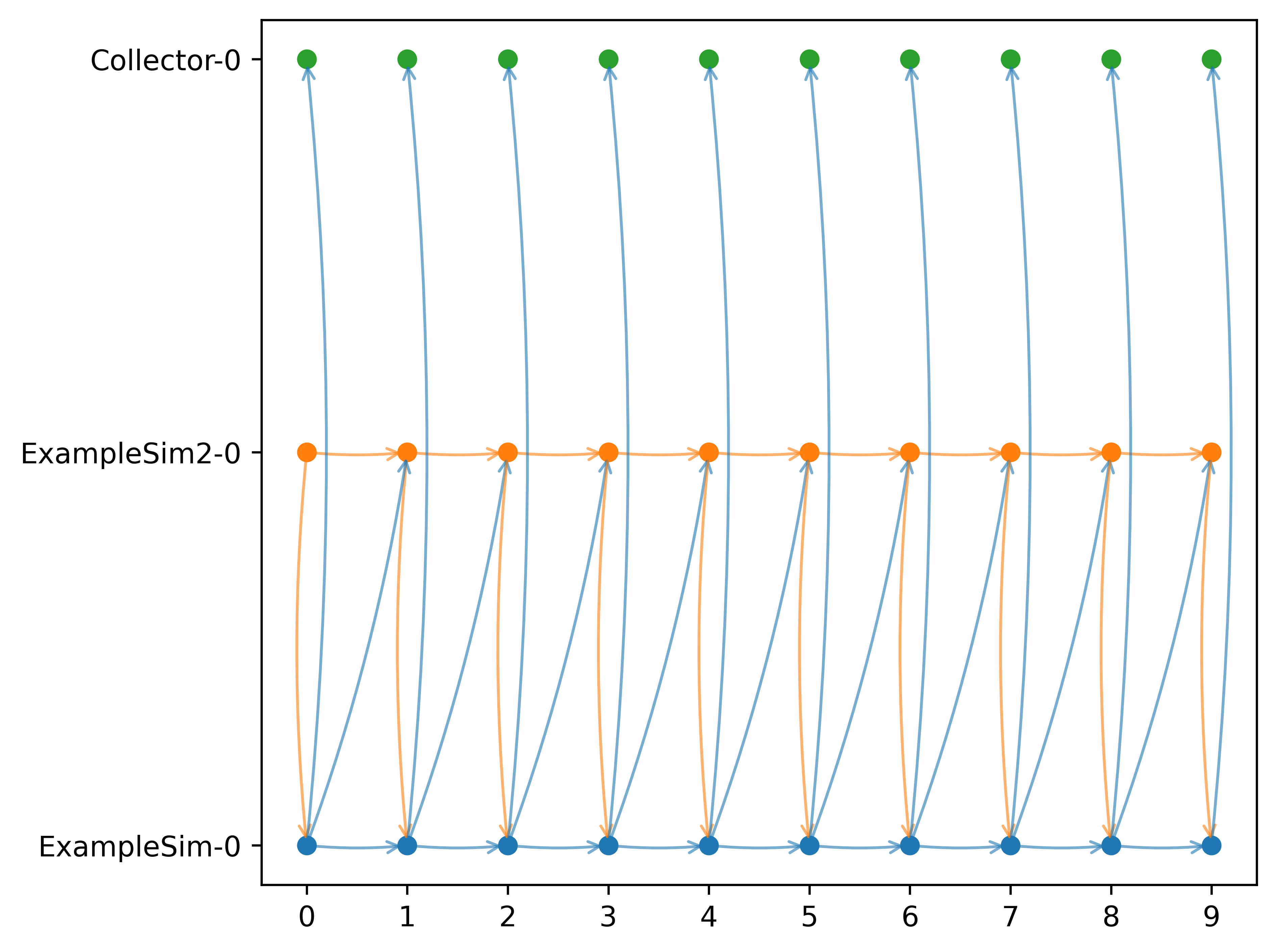
Dataflow graph
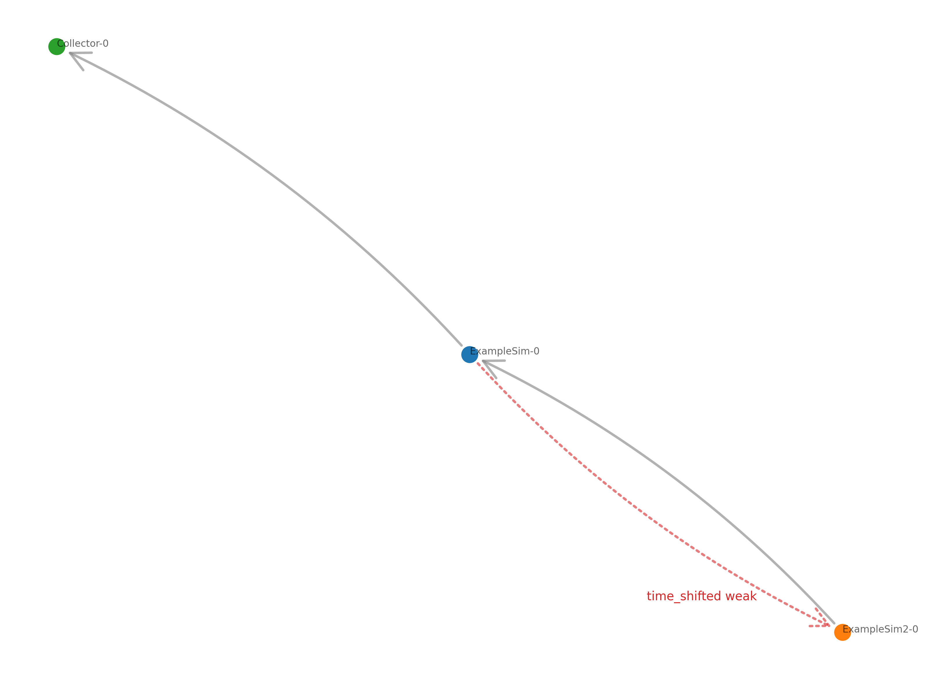
The dataflow graph shows the direction of the dataflow between the simulators. In the example below, the ExampleSim simulator sends data to the Collector. The ExampleSim2 sends data to ExampleSim. The dataflow connection from ExampleSim to ExampleSim2 is both weak (dotted line) and timeshifted (red line), which can be seen in the red label.
Plotly dataflow graph with groups
If you want to highlight simulator groups directly inside the dataflow
graph, use mosaik.util.plot_df_graph_groups. The helper
uses Plotly, so install it via pip
install plotly before running the example below:
 1"""Scenario that highlights group overlays
 2in the Plotly dataflow graph."""
 3
 4import mosaik
 5import mosaik.util
 6
 7SIM_CONFIG = {
 8    "Input": {"python": "mosaik.basic_simulators.input_simulator:InputSimulator"},
 9    "Output": {"python": "mosaik.basic_simulators.output_simulator:OutputSimulator"},
10}
11
12END = 5
13
14
15def main() -> None:
16    with mosaik.World(SIM_CONFIG, debug=False) as world:
17        with world.group("North Campus"):
18            with world.group("Solar Farm"):
19                north_solar = world.start("Input", sim_id="NorthSolar").Constant(
20                    constant=2
21                )
22            north_gen = world.start("Input", sim_id="NorthGen").Constant(constant=3)
23            north_grid = world.start("Output", sim_id="NorthGrid").Dict()
24
25        with world.group("South Campus"):
26            south_gen = world.start("Input", sim_id="SouthGen").Constant(constant=5)
27
28        monitor = world.start("Output", sim_id="Monitor").Dict()
29
30        world.connect(north_solar, north_grid, ("value", "value"))
31        world.connect(
32            north_gen,
33            north_grid,
34            ("value", "value"),
35            weak=True,
36        )
37        world.connect(north_gen, monitor, ("value", "value"))
38        world.connect(south_gen, monitor, ("value", "value"))
39
40        world.run(until=END)
41
42        fig = mosaik.util.plot_df_graph_groups(world, show_plot=False)
43        fig.write_html("dataflow_groups.html", include_plotlyjs="cdn")
44
45
46if __name__ == "__main__":
47    main()
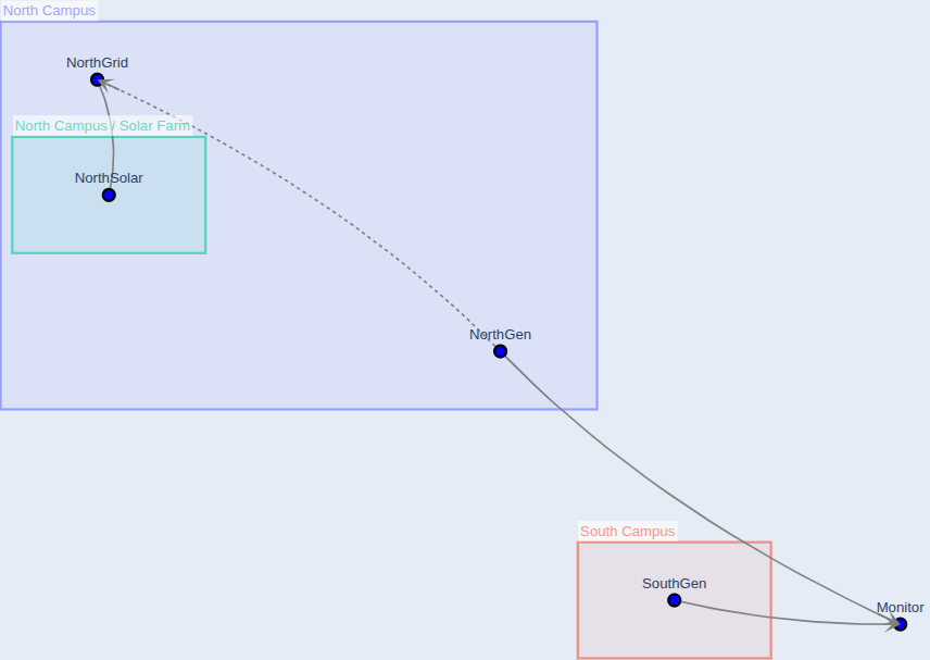
When you open the generated dataflow_groups.html after running the code above,
you should see a graph similar to the one below.
It shows the group overlays in the background (for example North Campus and
North Campus / Solar Farm) together with the weak dataflow edges.
Set show_plot=True if you want Plotly to immediately open the figure
while the script is running.
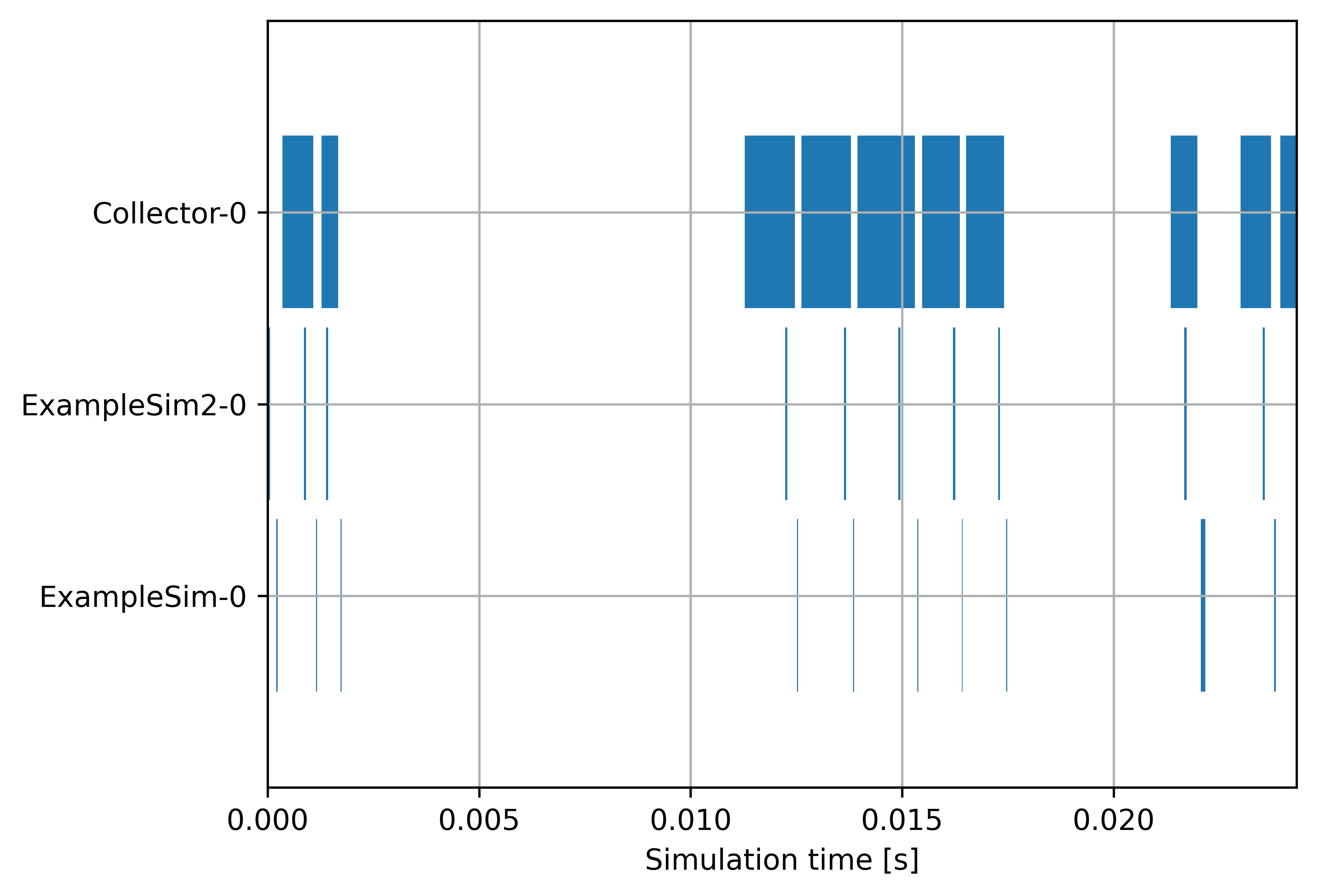
Execution graph
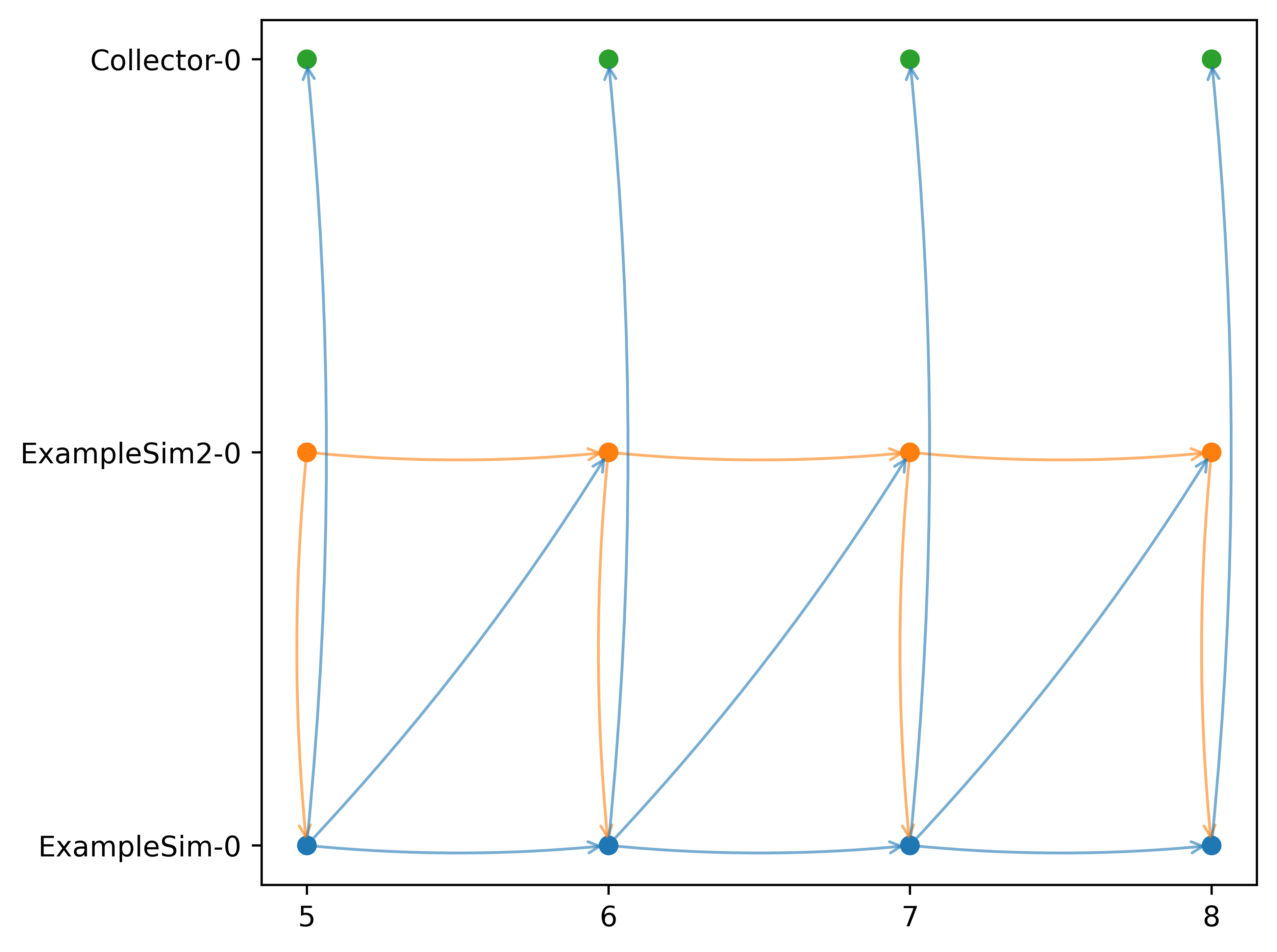
The execution graph shows the order in which the simulators are executed. Differing from the example above, the connection between ExampleSim and ExampleSim2 is only marked as weak, not as timeshifted.
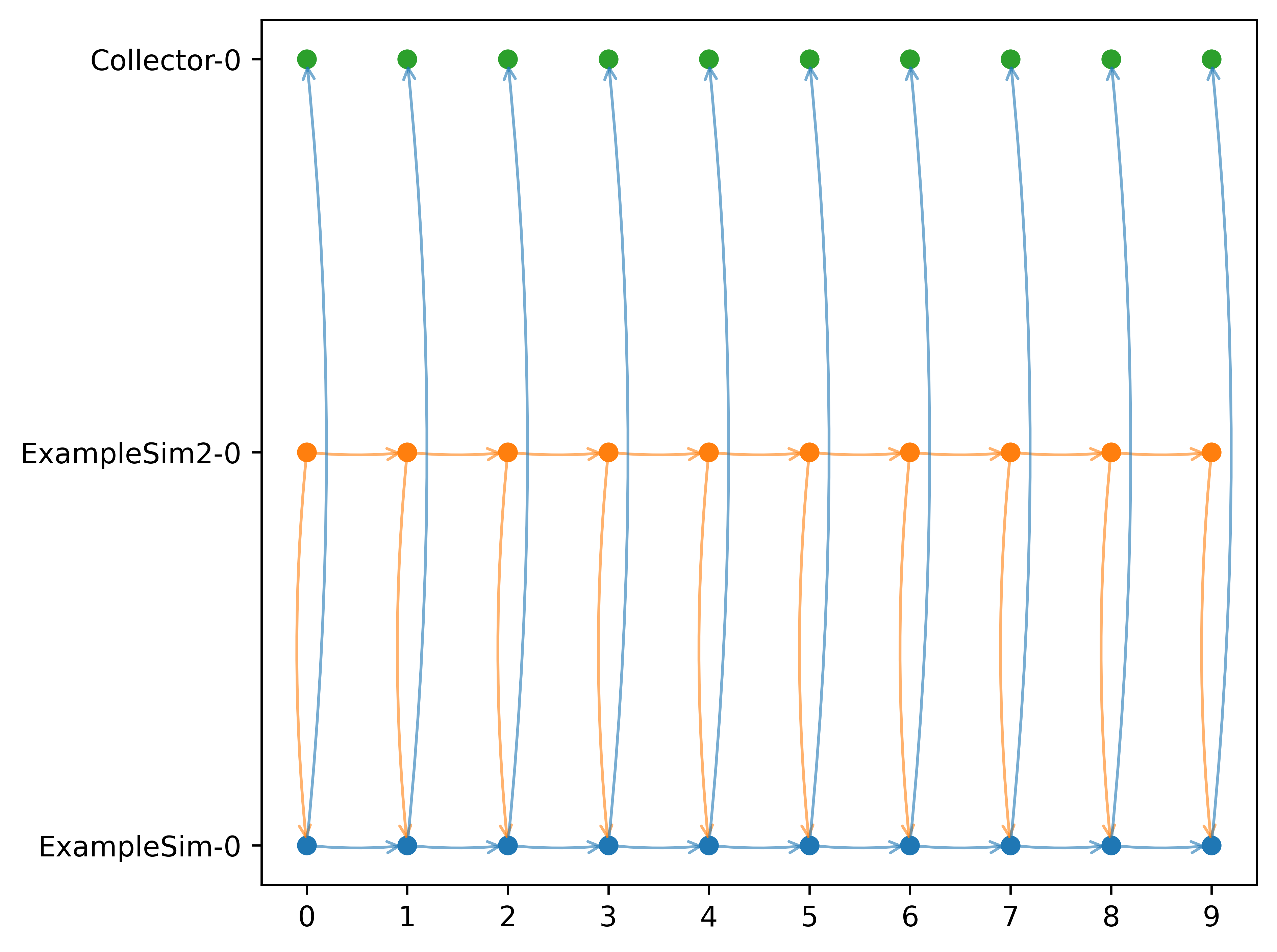
If we add back the timeshift parameter, we get an additional arrow from ExampleSim to ExampleSim2. That is because the data from ExampleSim is used in ExampleSim2 in a timeshifted manner, i.e., from the previous step. This is the Gauss-Seidel scheme.
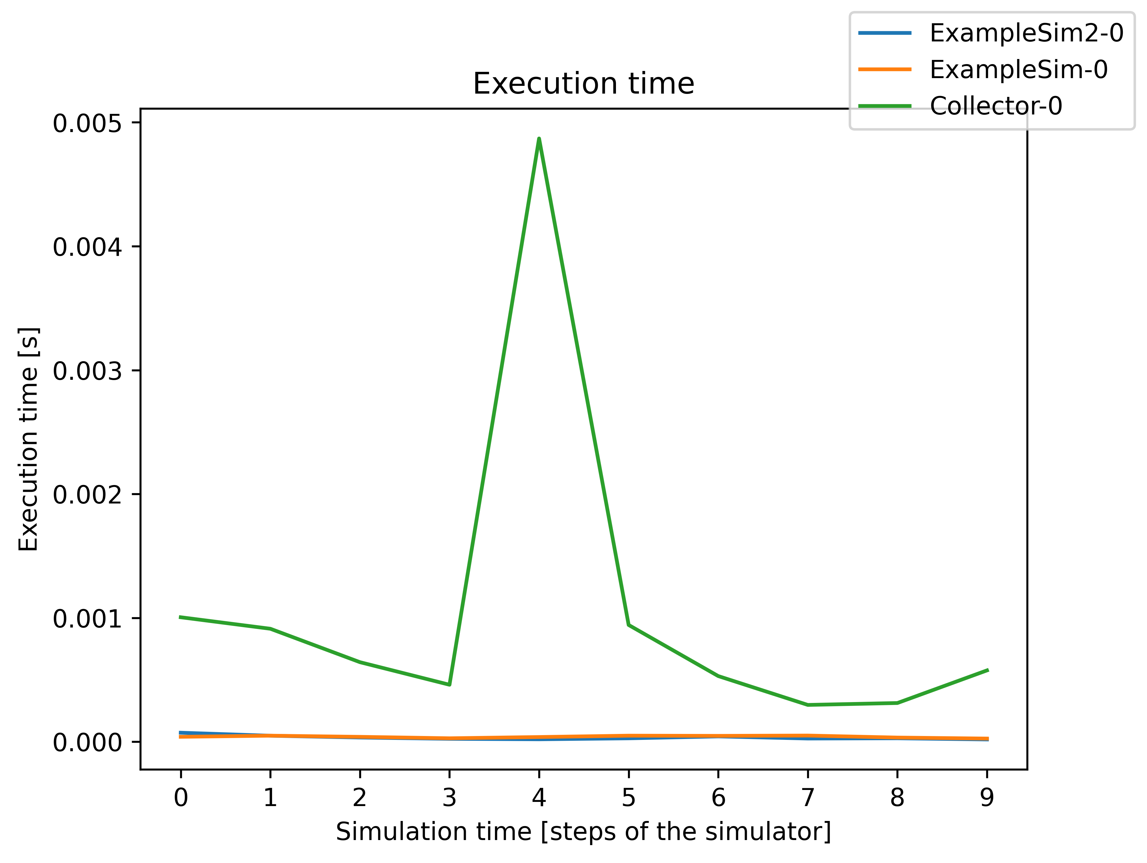
Execution time
The execution time graph shows the execution time of the different simulators so that it can be seen where the simulation takes more or less time. In the example below it can be seen that the Collector uses comparatively more time than the ExampleSim simulators.
Execution time per simulator
The execution time can also be plotted over the simulation steps per simulator, as can be seen in the figure below. You can also set the parameter plot_per_simulator=True. In that case, the plots for the different are separated. This is especially useful if the simulators have different step sizes.
Slicing the graphs
If you are especially interested in a certain part of the simulation to be shown you can slice the time steps for the execution graph, the execution time graph, and the execution time per simulator. You can use the slicing as with Python list slicing. Jumps are not possible. Below you can see a few examples:
mosaik.util.plot_execution_graph(world, folder='util_figures', slice=[-5,-1])
mosaik.util.plot_execution_time(world, folder='util_figures', slice=[0,5])
mosaik.util.plot_execution_time_per_simulator(world, folder='util_figures', slice=[-4,-1])
Below is the execution graph sliced as shown in the example code above.